About the Project
This is a redesign practice on the player screen of Shazam mobile app. The app was reviewed on Jan 2015.
I firstly map out the basic structure of the current design, then review the flow connected to the player screen, go through the Heuristics and eventually provided redesign solutions with an Interactive demo.
More Framer prototypes are coming soon demonstrating other flows.
Role and Responsibilities
It is an independent project.
At the time I just got to know Nielsen’s Heuristics so this project helped me understand the theory a lot better.
Initial Research
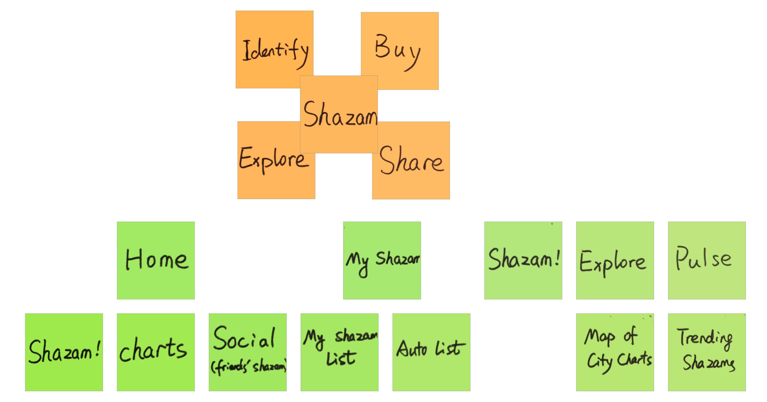
Utilizing post-it, I mapped out the basic structure of the current app.
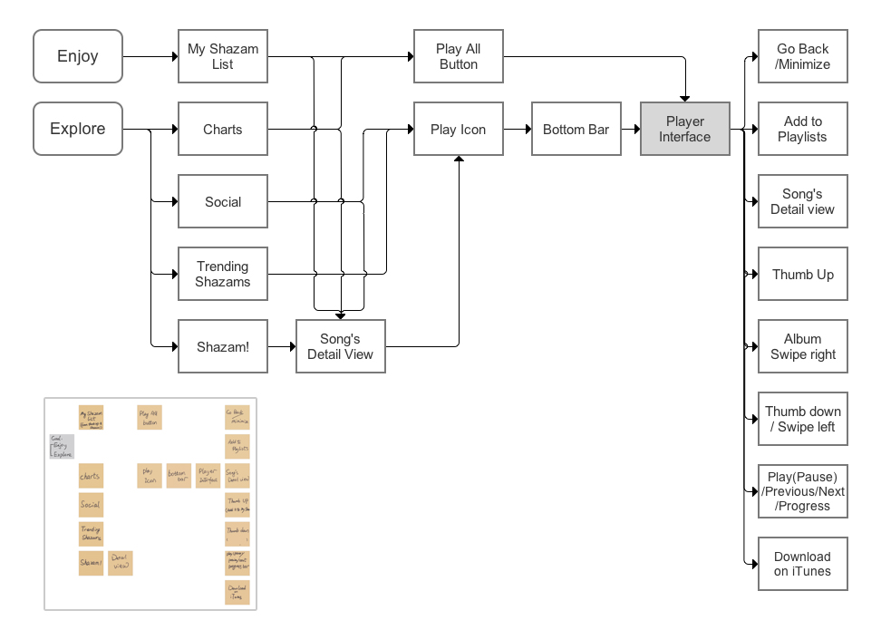
Then I created the user flow connected to the player screen I’m about to review.
Problems Found Listed in Heuristics:
Visibility of system status:
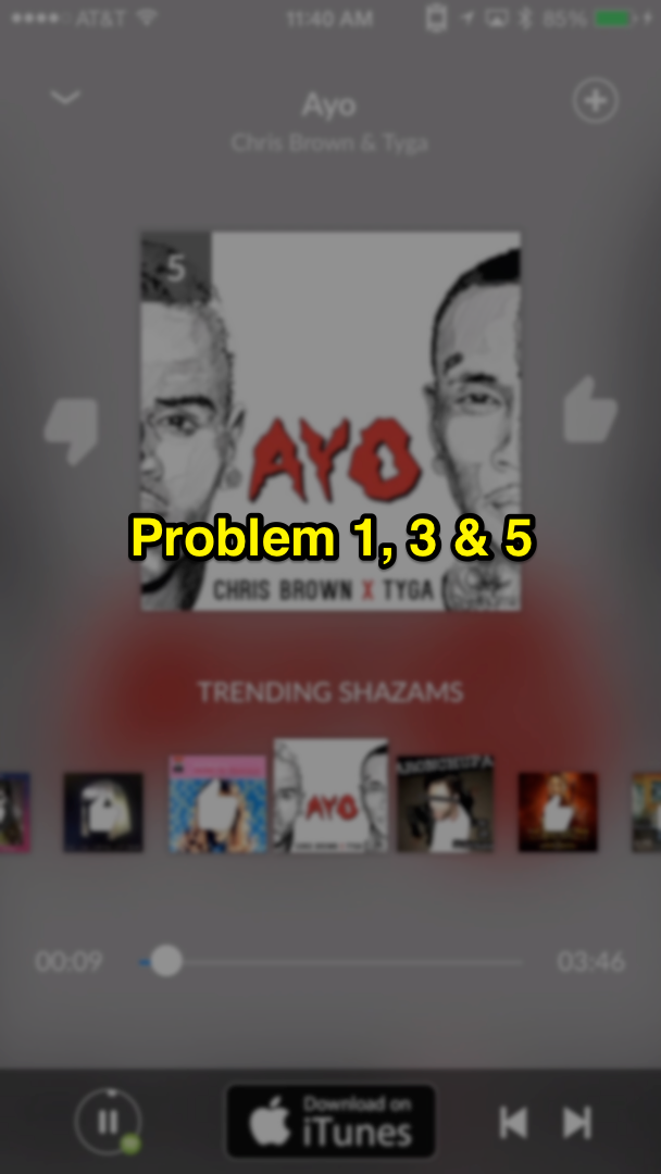
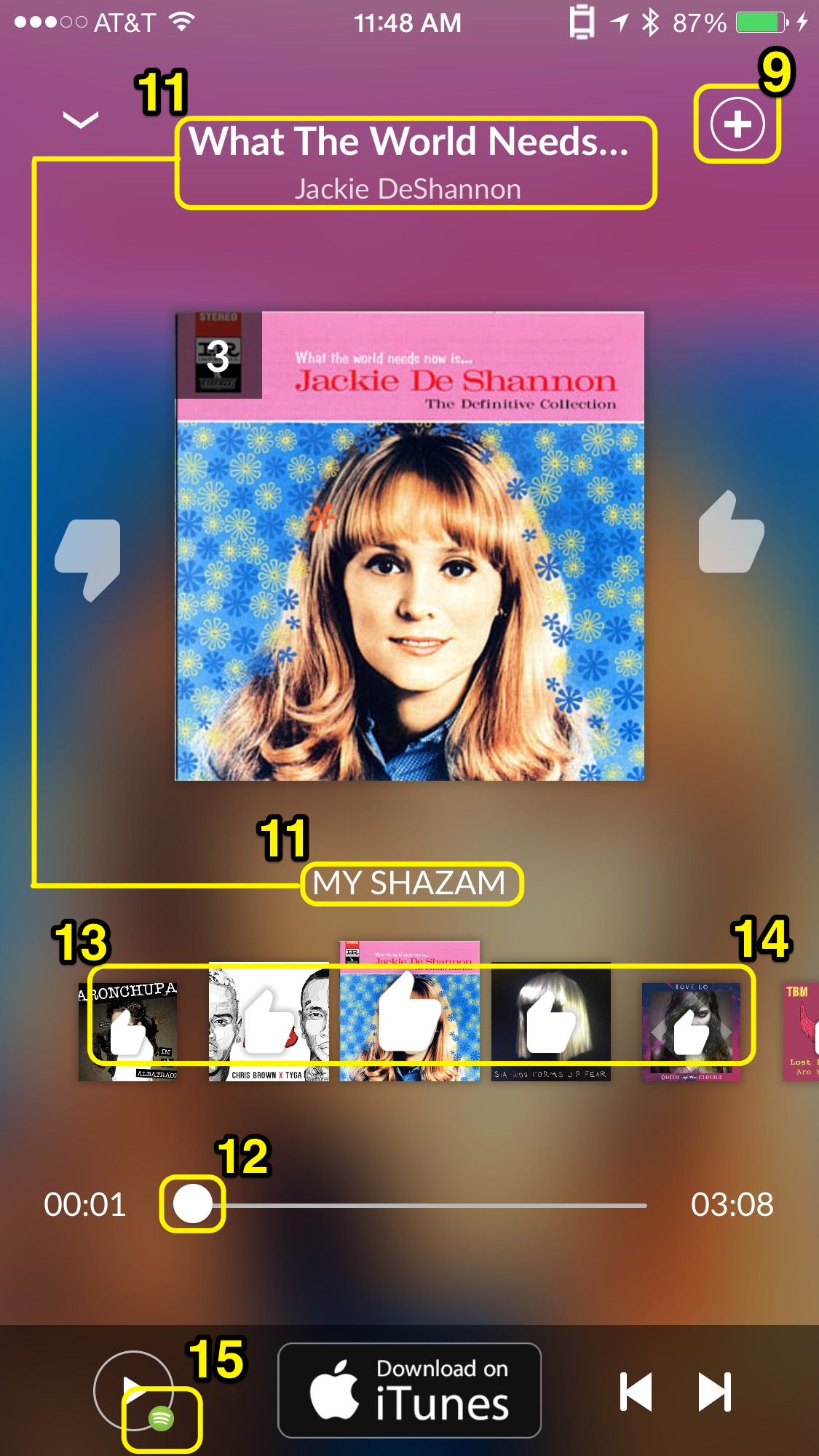
- No name of the highlighted song is displayed when scrolling through the playlist.
Match Between system and the real world:
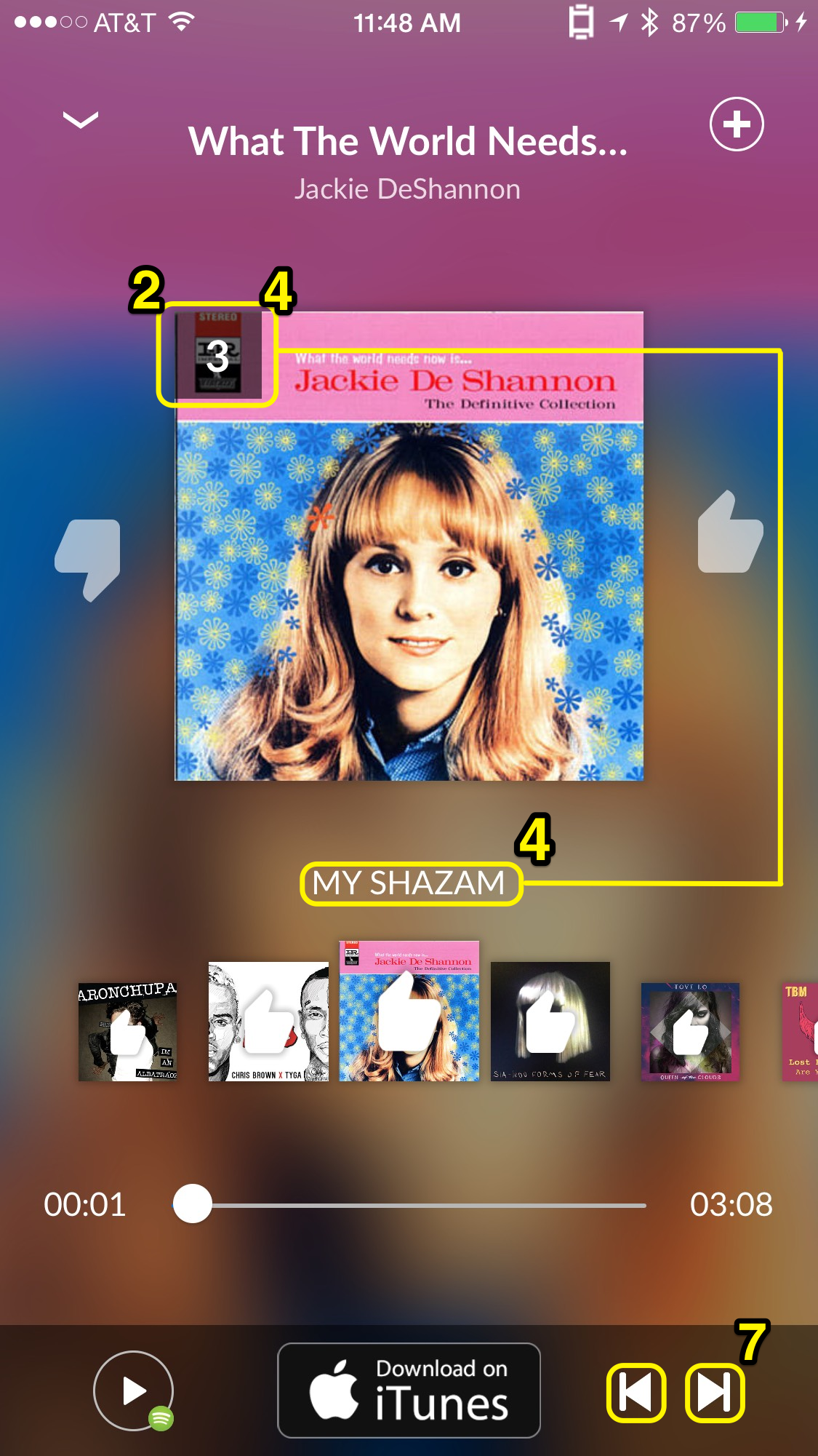
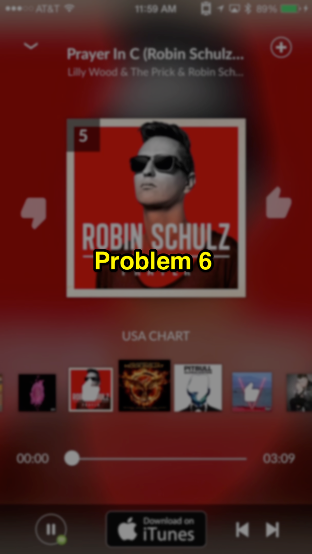
- The ranking number of each song is placed at the top left corner of each album cover when playing the music, which is hard to discover and not normal.
- (When first entering the player interface, a little instruction pop up teaching the users to swipe albums to each side showing like/dislike) But the thumb up and thumb down icon serves not only as signifiers of swiping but also buttons serving different purposes. The button function is hard to discover.
Consistency and standards:
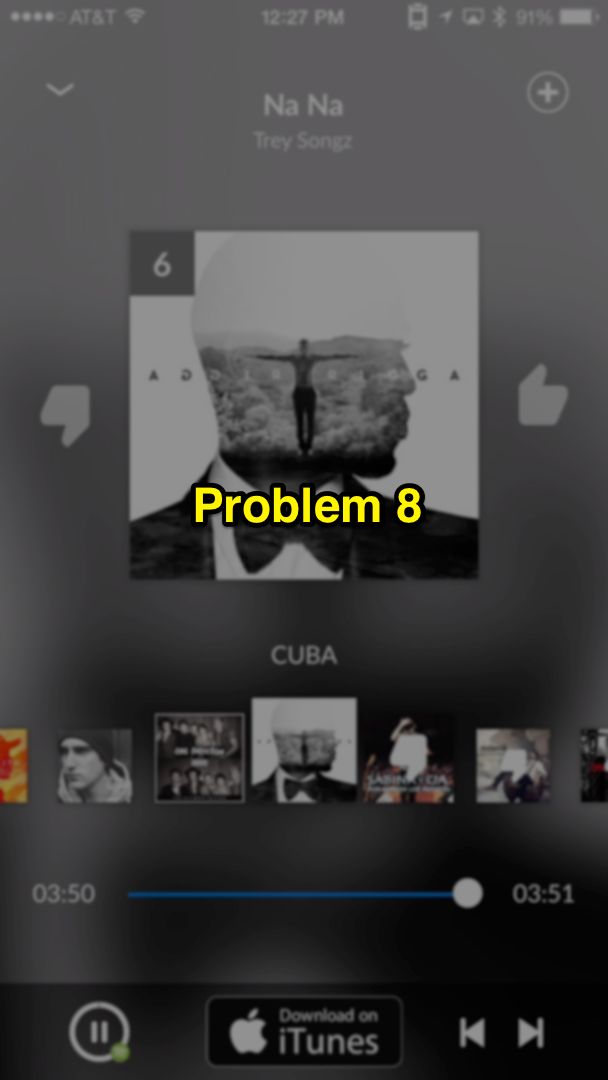
- When playing the My Shazam list, the number on the top left corner still exists representing the order of the song in the list instead of representing ranking.
- The app treats tapping on the “thumb up” icon and swiping the album to the right differently. By Tapping, it will keep playing the current song while by swiping it will skip the song.
Error prevention:
- When playing a list of songs and having the player minimized, as song as the user tap to play a new song/playlist, the previous list will no longer exist.
- Previous and next button on the right bottom is too small to be tapped on, causing users to click on the other one.
Flexibility and Efficiency of use:
- When playing through a list of songs, the player won’t skip the already “thumbed down” songs which makes thumb down/swiping right meaningless.
- When pressing the add button at the top right corner, it will shows two options when the user is connected to Rdio/Spotify, one of them is add to My Shazam, which is a duplicate action as swiping the album right.
- Songs added to My Shazam by “Shazam!” aren’t automatically marked “thumb up”, which add an extra definition to the users causing confusion and inefficiency.
Aesthetic and Minimalist design:
- The playlist name is placed in between the current playing album cover and the playlist albums, the distance to the current one is even closer than the name and artist of the song. It may mislead users to think the playlist name is the name of the song.
- The music progress controller is useless when connected to Rdio, and is meaningless when the user isn’t connected to any streaming services becausel the playback time is only 30 seconds for each song.
- When a song in the playlist is already thumbed, it shows a big thumb covering 50% of the album cover which make it harder for people to recognize the album by its graphic.
- When hit Play All in My Shazam, the playlist shows all the albums with the thumb up(except the ones added from “Shazam!”), which is adding an unnecessary extra information to the interface.
- Once it’s connected to one of the streaming services, it is not necessary to show a small spotify/Rdio icon with the play/pause button. Instead, it should show the ones, who are not included in each service’s library.
Redesign Solution Wireframes
Interaction/Motion redesign solving problems: 1, 2, 3, 5, 6, 7, 11, 13, 14.
Other solutions:
- Hide ranking number when tap on "Play All" in My Shazam
- When taping to play a new song, always add the song to the playlist, and create a stacked previous album list based on the above presented wireframe.
- Skip the already "disliked" songs when playing.
- Directly shows the music streaming service's playlist choosing tab instead of showing two options.
- Automatically mark the songs that are Shazamed by the user.
- Hide the music progress controller but just show the progress when it's not controllable or the user hasn't connected to any of the services, as shown in the wireframe.
- Only indicate the unavailable songs with a special icon when connected to one of the streaming services.