About the Project
During the summer of 2014, I joined Royal Caribbean Celebrity Cruises as an UX Design Intern.
It was an amazing experience as I worked with a senior UX Designer in the corporate environment iterating current design, conducting usability test and A/B testing.
Role and Responsibilities
I worked with a senior UX designer on most of the projects.
Here are the two major work we’ve done together during my time there.
Destinations Page Usability Test
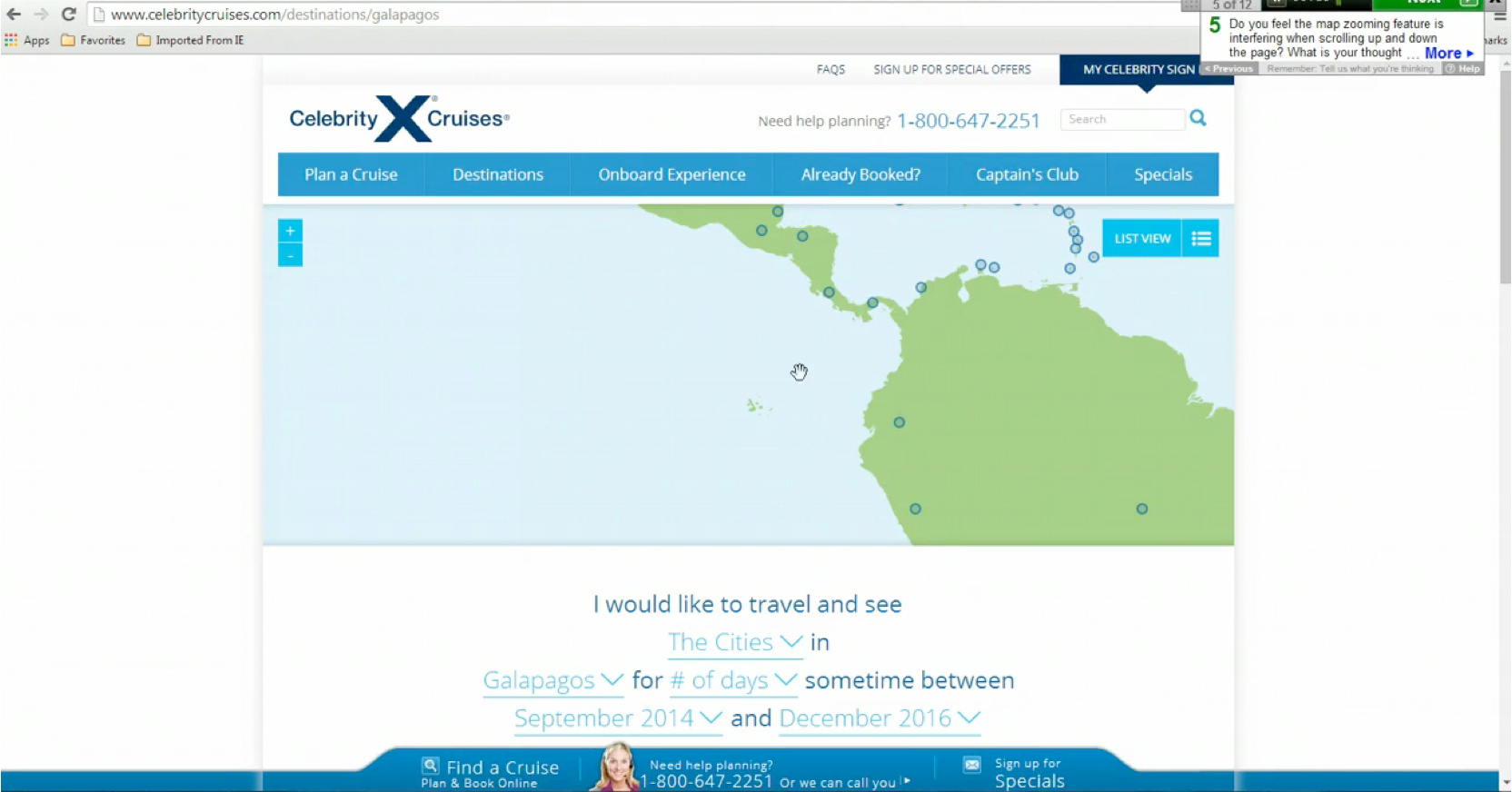
Destinations page was designed to inspire people about various destinations and to motivate them to eventually book a cruise on the site. And the marketing team has been promoted the page for a while both through newsletters and search engine guiding the user directly to this page.
The problem is, users don’t go through the designed path and we got pretty low traffic and conversion rate through it.
A qualitative usability test would help figure out why.
Target participants would be Average Internet Users from 35 to 60 with the income of 100K+.
A Serious of 12 questions and followups are made to:
- Have participants explore the page freely first, getting the idea of user’s expectation and see if their behavior fits the designed path
- Assign them a step-by-step task to find a specific cruise line through the current page, analyse their behavior.
- Ask them about detailed function of each section and their feedback.
By examining all results from usertesting.com, we found out several issues causing the confusion and frustration, among them are:
Overflow vertical layout, overwhelming infinite scroll, visual redundancy etc.
- Overflow vertical layout: Participants don’t realize when making selection either through the map or the dropdown, the content underneath (below the viewport) is changing accordingly, the missing feedback users harder to understand the represented model.

- Infinite scroll: Most of the participants find this function overwhelming and takes a long time to populate the following content.
- Content and visual: Same thumbnail image and content pop up several times on a single page.
- Other issues: Our target participants find text dropdown hard to discover and understand, quite a few experience delay on loading the page.
Here are some correspond suggestions:
- Change the overall layout of the page: The map and content tiles split the screen while contextual dropdown pins to the top right corner.
- Arrange tiles into 3 categories: Related Cruise lines, Places and Promotions. Each takes up one row of the tiles so there’s a pattern to follow both visually and logically.
- Replace infinite scroll with traditional pagenation for tile content.
- Offer more visual affordance to the dropdown. Reduce to 3 lines of text to save more space for the content below.
Cruise Listing Design Iteration
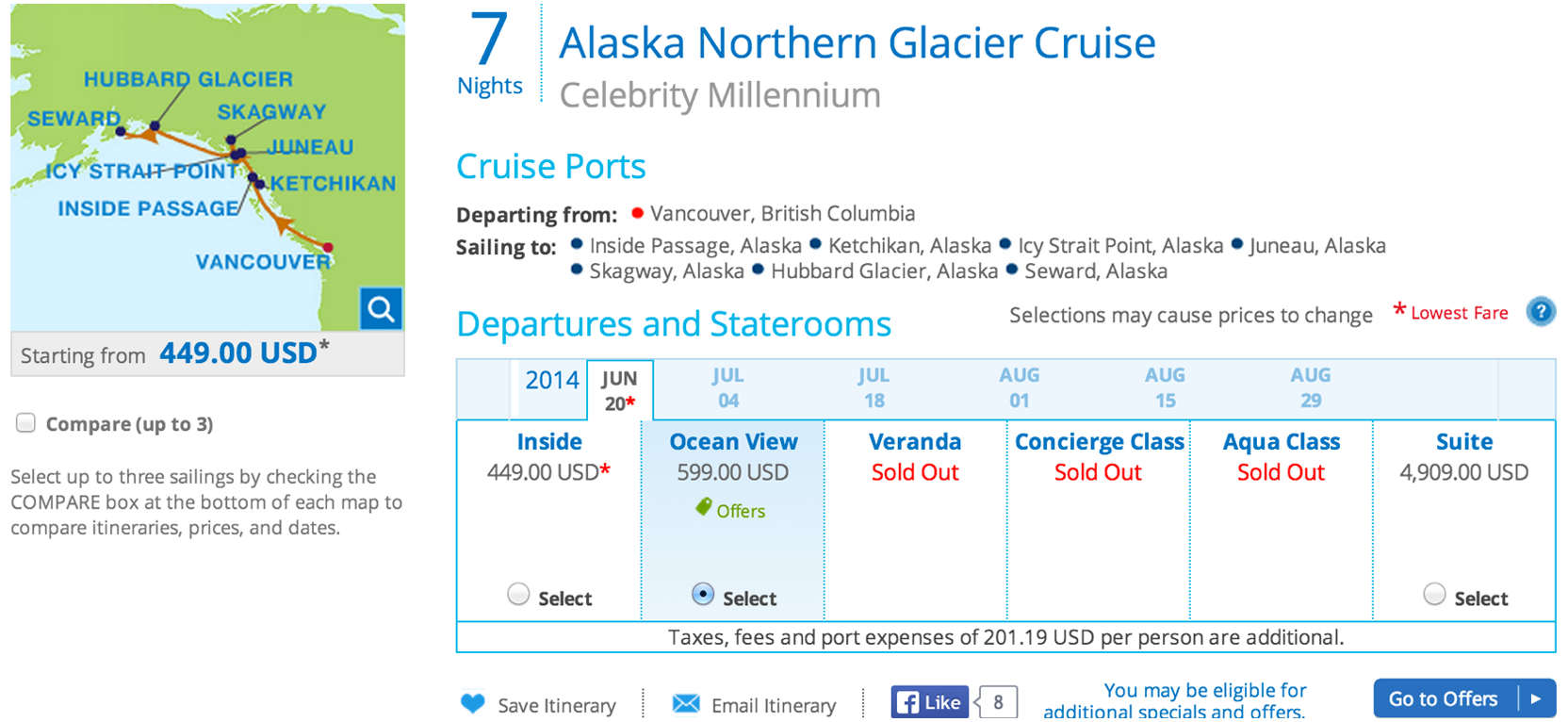
Initially I was tasked to redesign the green offer tag to solve the affordance problem revealed by our customer support team that users tend to click on it.

A quick expert review helped me out more problems on the design.
- Asterisks confusion: Two asterisks on the same listing refer to two different things, one to the lowest fare and the other to the legal copy below.
- Hierarchy disorder: ‘Lowest fare’ and ‘sold out’ are colored red but both are not considered the most important elements on the page.
- CTA copy confusion: Does not provide strong click through context. It actually leads the users to the next step of the funnel but the message is pretty weak.
- Cluttered layout: There is some extra information (lowest Fare, selection may cause prices to change, social buttons etc) organized in a cluttered way which makes the interface more unnecessary complicated.
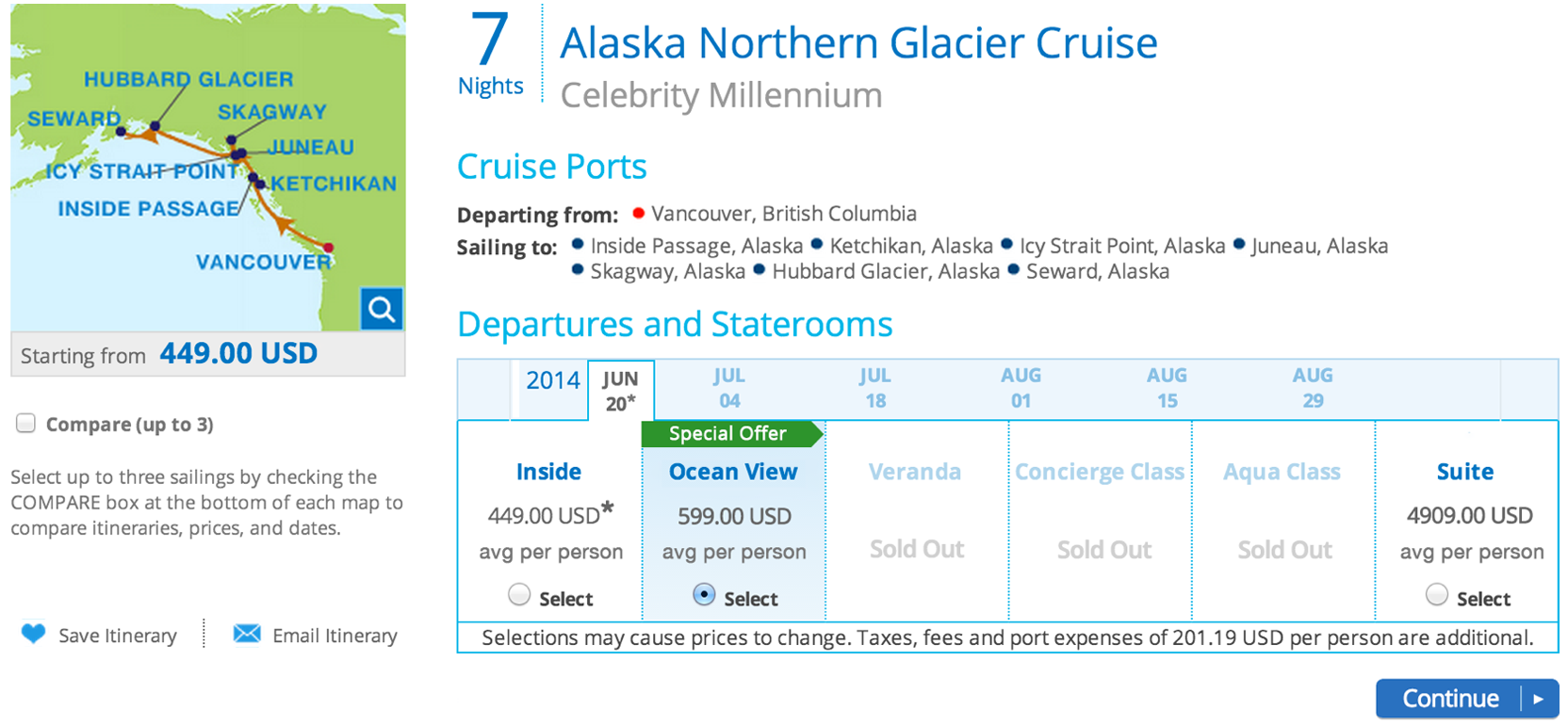
I ran these findings over with my co-worker, he agreed on them and advices me to create a solution with minimum tech requirements.
Here’s the final solution with minimum text and layout change. we also agreed to run an A/B test on alternative CTA copies.

